CLYOS – SWISS INSTITUTE FOR CHARACTER SCIENCE
Brand launch with character
HELLO
CLYOS
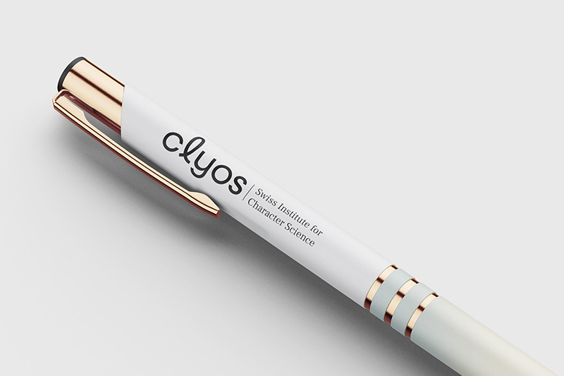
When trust grows out of successful collaboration: We already have a shared history with Manuela Kohler, co-founder of CLYOS – from her time as managing director of Kohler Medizintechnik, we know her to be an appreciative and constructive collaborator. When she co-founded the start-up CLYOS, it quickly became clear who would be at her side in building the brand. CLYOS is developing a scientifically based and tamper-proof character strength test – a visionary project that rethinks individual strengths. Logo, corporate design, and launch for the marketing campaign? A task right up our alley.
DO IT
CLYOS aims high – and we're taking off with them. At the kick-off, we dive into the brand world together, listen and get a feel for where the journey should take us. The first drafts for the logo and key visual hit the mark and show that we are on the same wavelength. Now it's time to get started: with a clearly structured landing page and an eye-catching roll-up banner, we are laying the foundation for a successful market launch.
SEE CLEARLY
Clear brand values
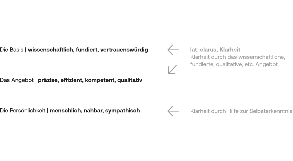
The basis for a strong image? A clear internal profile. CLYOS provides us with a comprehensive communication paper and a well-thought-out concept presentation containing the key terms and images that define the company.
A treasure trove of content from which we jointly shape the brand identity. These so-called core worlds form the foundation for the logo, design, and tone.
MERGE WORLDS
Uniting people and science
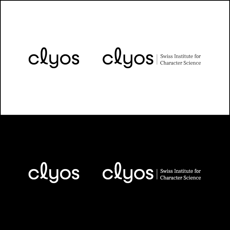
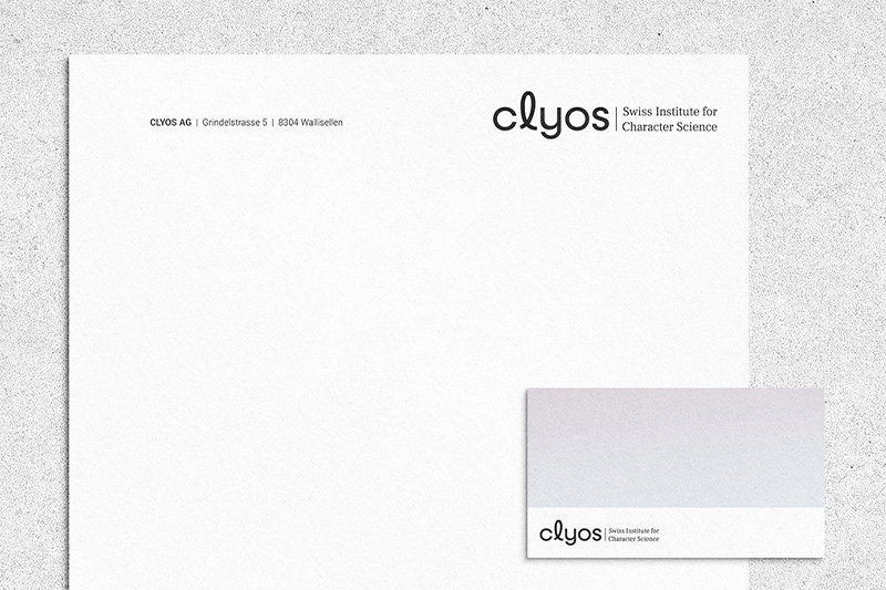
The CLYOS word mark is more than just a name—it is a statement. To convey this, we chose the Neulis font, which combines geometric precision with an emotional handwriting style. The characteristic “L” stands out in particular: an elegant flourish that embodies individuality and humanity. It deliberately contrasts with the other letters, yet blends harmoniously into the overall picture – a design symbol for the combination of individual closeness and scientific precision that CLYOS unites.
SEE THROUGH
A key visual that makes it visible
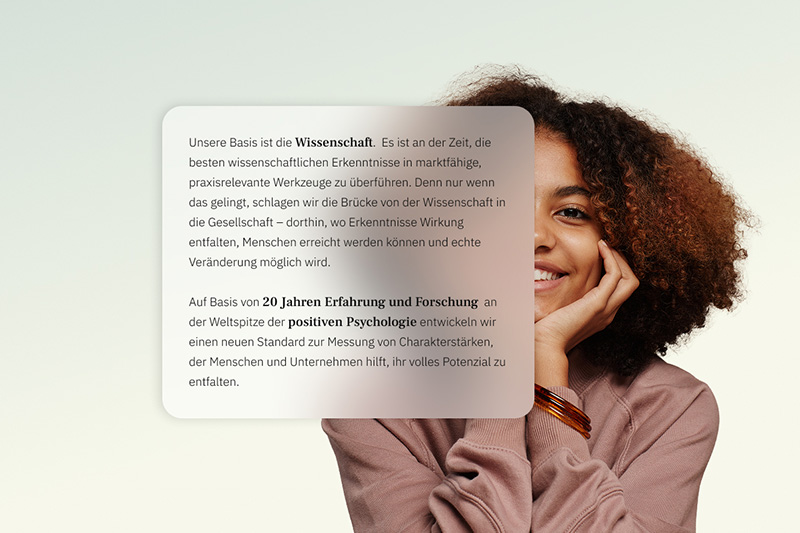
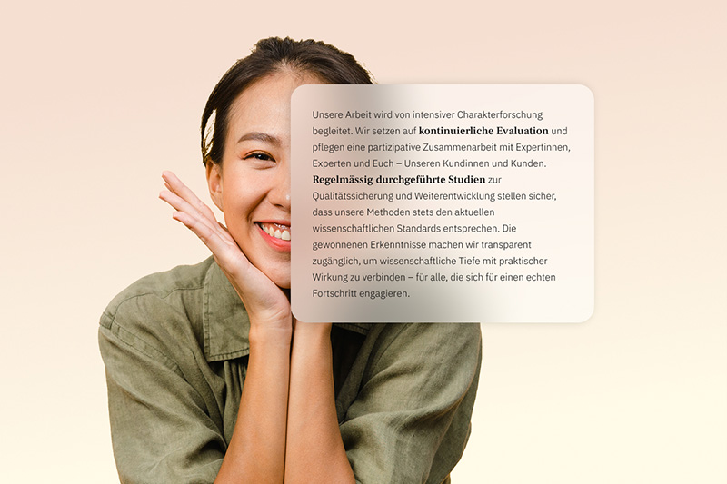
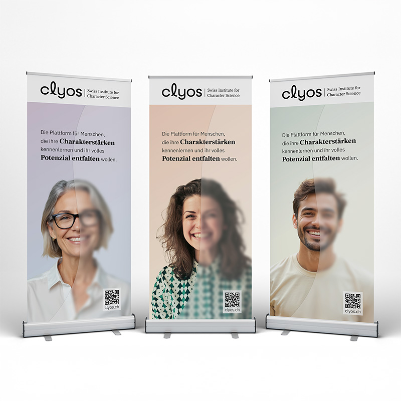
How do you make character strengths visible? The key visual depicts people behind a milky glass wall—sometimes blurred, sometimes clear, depending on the distance. A powerful metaphor for the process of discovery that CLYOS initiates. The closer you look, the clearer individual strengths become.
The color scheme: soft pastel gradients, subtle, almost restrained—because the focus is on people. The colors flow into one another like the facets of character that come together to form a complete picture. The logo never appears on color, but always on white, on clarity. This keeps the brand legible, stable, and reliable—in keeping with its values.

SHOW UP
CLYOS on stage
The key visual at full height – the rollup brings clarity to the stage. Design, final artwork, and production are all handled by us. The banner is then sent directly to the customer and has since been used in workshops to further develop the character strength test and in startup presentations. Visual presence meets depth of content.
GO LIVE
Website with depth
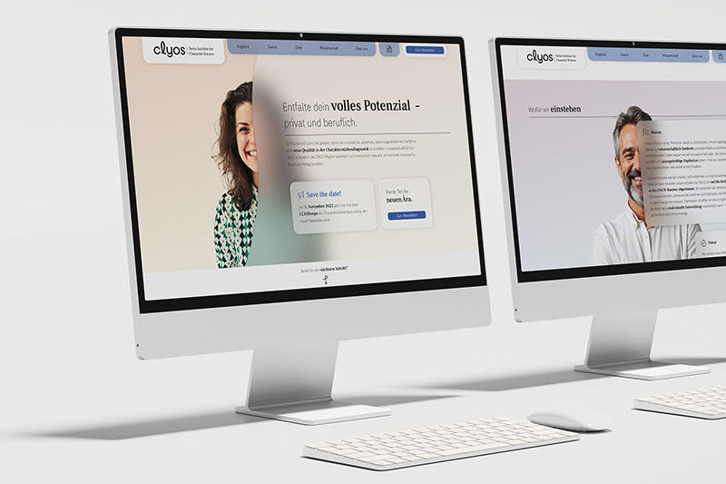
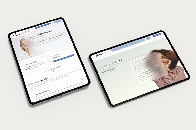
Concept, design, and implementation—all by Atelier Türke. The landing page sums up the CLYOS brand world: the key visual is staged in a multifaceted way across people and color gradients, while subtle, appealing icons provide orientation where there are no images. The page deliberately remains text-heavy:
CLYOS opts for transparency and depth. This means that the scientific basis is also evident in its digital presence. The integrated newsletter registration function lays the foundation for further development.
