CITY OF BALINGEN
New logo and corporate design for Balingen
HELLO
BALINGEN
Balingen – Lively, creative, and innovative. The city of Balingen sees itself as a dynamic and future-oriented city.
The city is holding a competition to develop a new logo and corporate design. The aim is to develop a design that represents Balingen as a livable city with urban flair, cultural diversity, and historical ties. The logo should be versatile and form the basis for a harmonious overall concept that covers all of Balingen's communication channels.
DO IT
When our own hometown is given a facelift, it's more than just a job for us. As an agency based in Balingen, we immediately put our hearts into the project and tackle it with passion. Our goal: to create a symbol that encapsulates Balingen's identity and conveys a sustainable vision of the future to the outside world.
After several rounds of presentations, we are delighted: our design wins over the jury and wins the competition. It is selected over four other agencies.
FEEL IT
One design language.
One logo. For everyone.
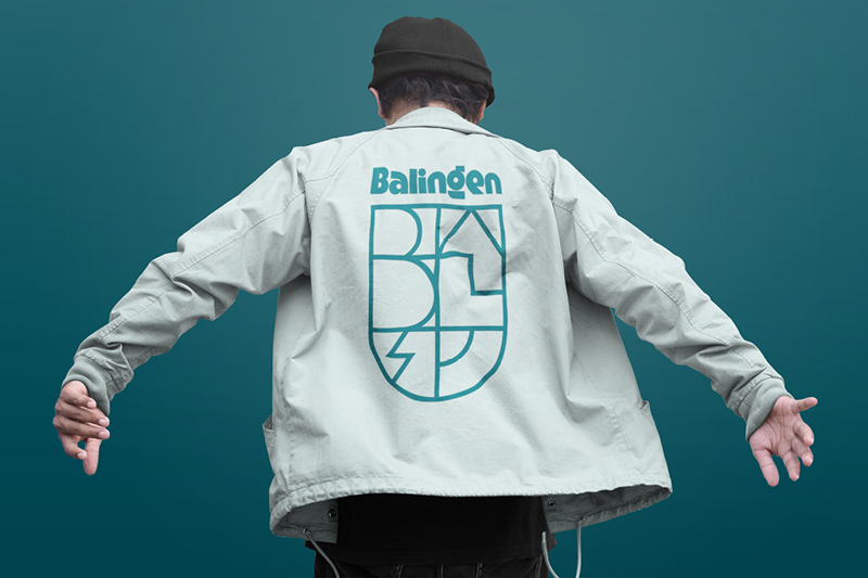
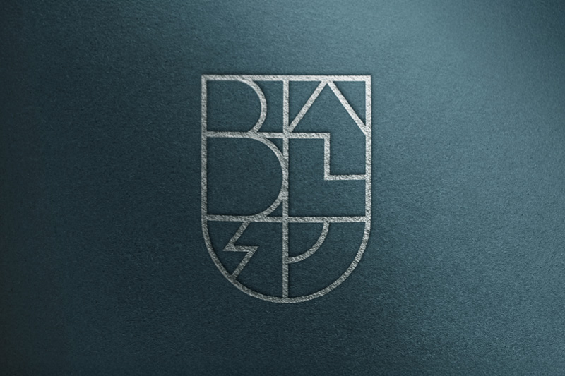
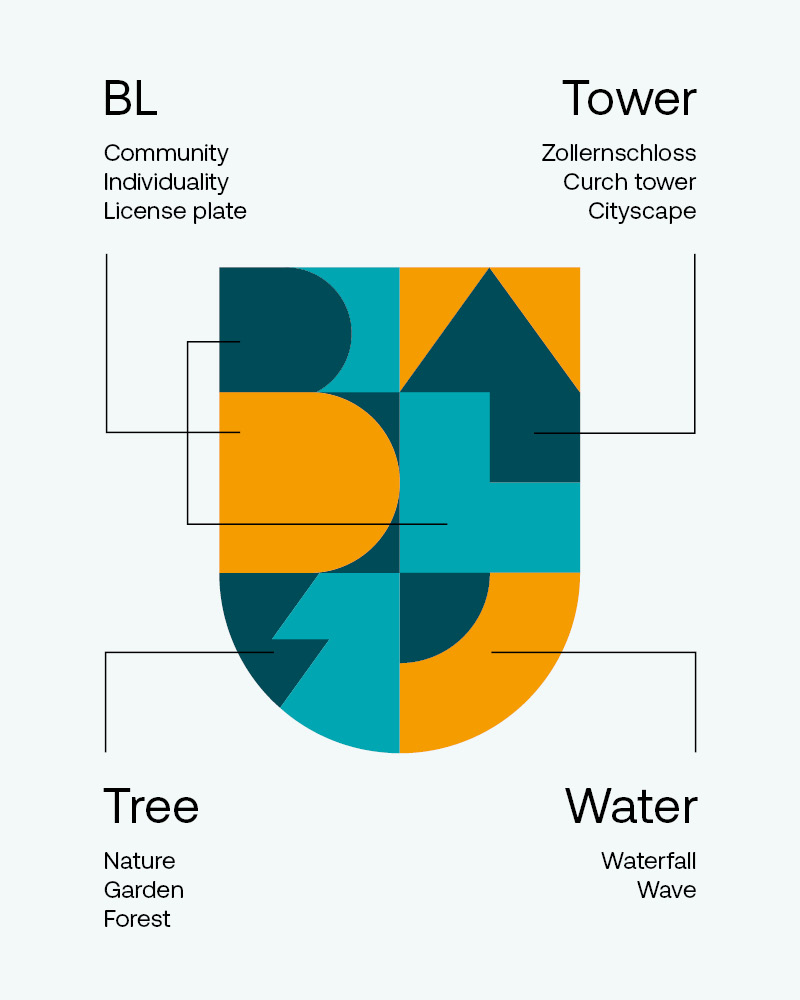
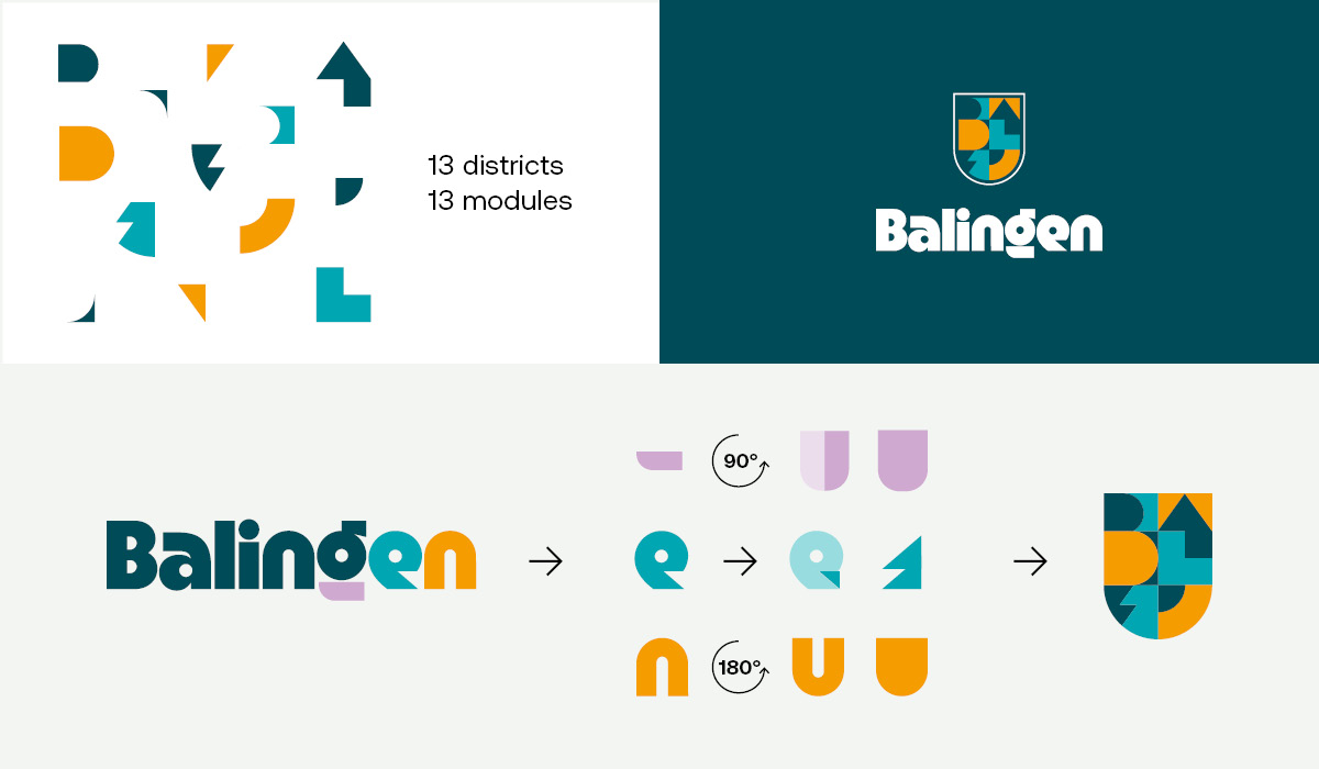
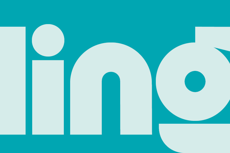
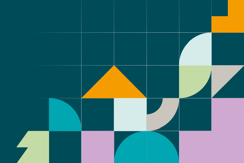
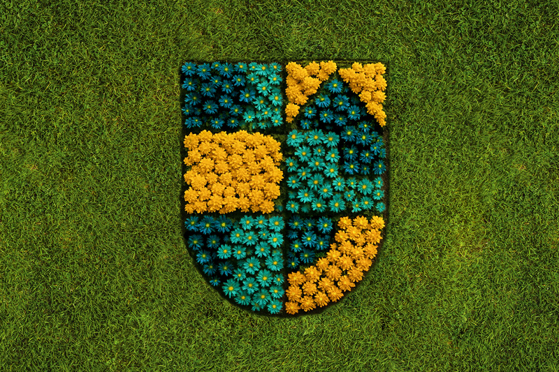
The new logo combines nature, water, and the distinctive cityscape—inspired by the surroundings, supported by the people. The 13 colorful building blocks represent the 13 districts of Balingen and reflect the diversity, creativity, and community spirit in Balingen. The new lettering takes up the geometric character of the previous lettering and translates it into a modern, concise form. The design language of the new logo is developed on this typographical basis. As a result, the image and word marks interlock seamlessly and together form a uniform, harmonious logo.
Shape it
Color, font, and form
become a brand.

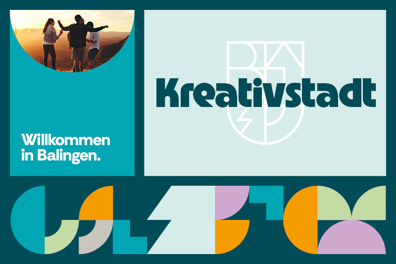
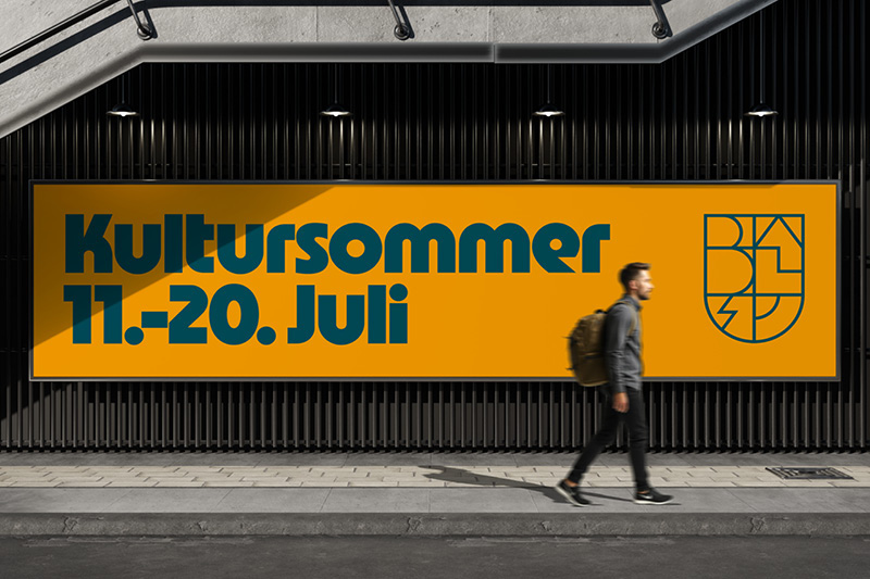
The new color scheme for Balingen deliberately focuses on a clear, distinctive combination: green-blue, light blue, and signal yellow provide a strong visual identity for Balingen's city logo. They combine a love of nature, modernity, and creativity into a harmonious whole that expresses both the tradition and future orientation of the city. The secondary colors expand the color scheme with additional nuances and make the corporate design noticeably more versatile.
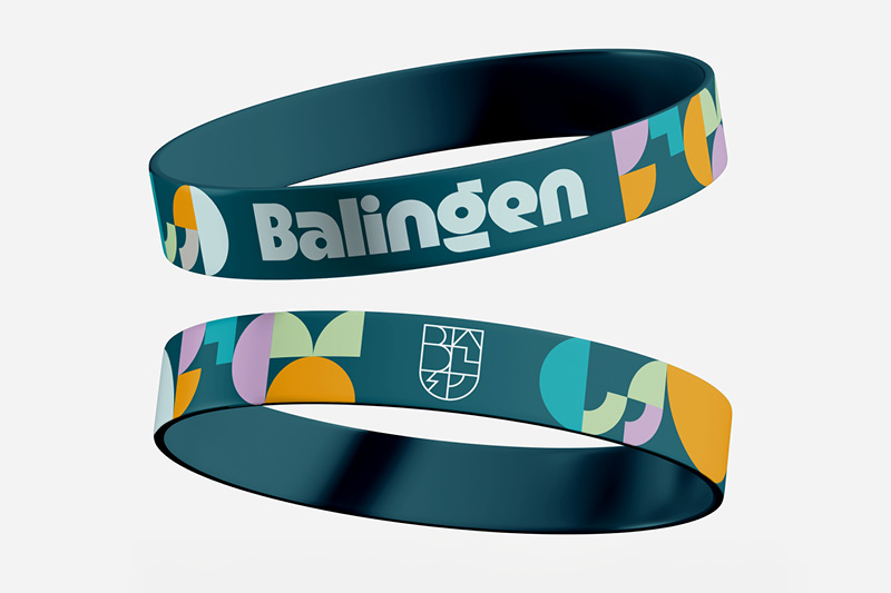
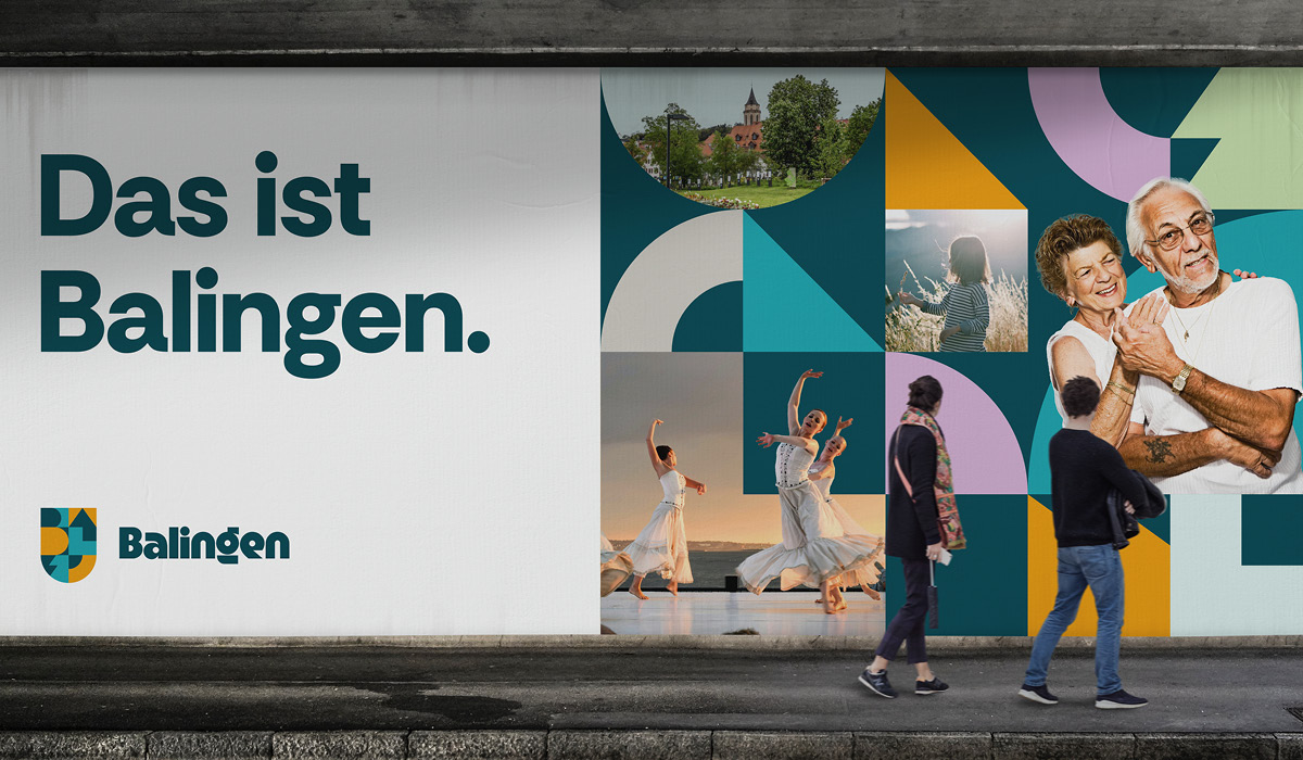
The new personality is also reflected in the typography: the fonts used for headlines and body text are distinctive and concise, and their characteristics perfectly match the logo. In addition, there is a design system consisting of graphic elements developed directly from the logo's design language, with references to the Balingen abbreviation BL, trees, towers, and water. The result is a corporate design that does not decorate, but tells a story: a connection to nature and home. Modernity. Creativity.
SHOUT OUT
Flexible within the system.
Clear in appearance.
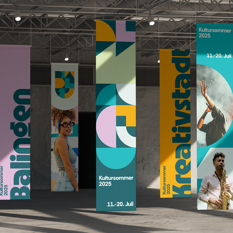
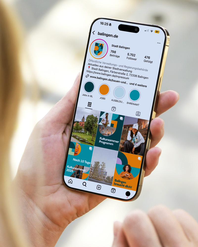
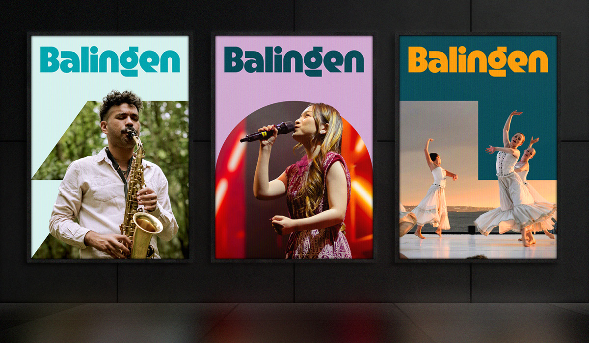
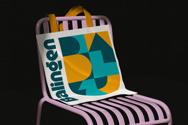
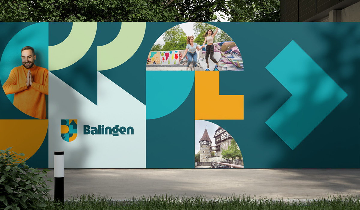
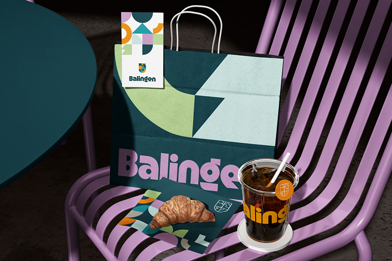
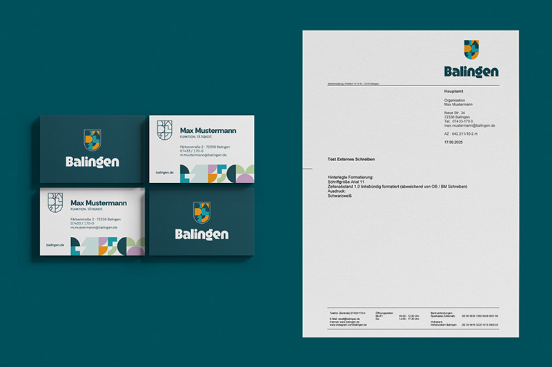
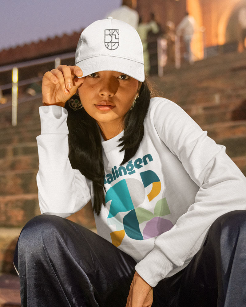
The new corporate design unfolds its full effect in the applications: logo, color scheme, typography, and design elements interlock seamlessly and create an appearance that is immediately recognizable—concise, consistent, and unmistakable. The graphic building blocks make the brand flexible: depending on the occasion, they can appear calmer or more lively, informative or emotional, formal or playful. The result is a design that adapts to any situation and yet always remains “Balingen.”
Balingen is reinterpreted: modern, creative, and future-oriented—while remaining connected to what defines the city. An overall look that works across all media and makes Balingen visible as a city with a future.
